There’s a reason some rooms feel alive the moment you walk in — and others, despite being beautifully furnished, fall quietly flat. The furniture is right. The colors work. Everything is in proportion. And yet something is missing.
That something is almost always texture.
Layering texture is one of the most misunderstood principles in interior design — not because it’s complicated, but because it’s invisible when it’s done well. The best rooms don’t advertise their materials. They just make you want to sit down and stay.
Why Texture Matters More Than Color
Most people start with color when they’re designing a room. It’s the obvious choice — color is immediate, emotional, and easy to communicate. But experienced designers know that texture carries more weight over time.
Color creates a first impression. Texture creates a lasting feeling.
A room painted in the most perfectly considered shade of warm white will still feel lifeless if every surface is smooth, flat, and uniform. Conversely, a room built around a relatively neutral palette — cream, stone, linen — can feel extraordinarily rich when the materials are varied, layered, and thoughtfully placed against each other.
The reason comes down to how we physically experience space. We don’t just see a room — we sense it. The roughness of a plaster wall. The weight of a heavy wool throw. The coolness of marble underfoot. These tactile qualities register even when we’re not consciously noticing them, and together they determine whether a room feels considered or empty.
The Three-Material Foundation
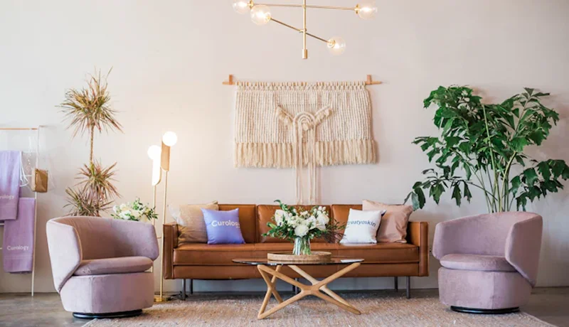
The approach I use on every project starts with what I call a three-material foundation: one hard surface, one soft surface, and one natural element. These three categories create enough contrast to give a room dimension, while staying simple enough to remain cohesive.
Hard: Stone, marble, concrete, lacquered cabinetry, plaster, ceramic tile. These surfaces anchor a room. They read as permanent and provide visual weight.
Soft: Upholstery, drapery, cushions, bedding, rugs. These surfaces invite contact and bring warmth. Without them, even the most beautiful hard materials feel institutional.
Natural: Timber, rattan, linen, leather, travertine, jute, aged brass. These are the materials that feel like they were found rather than specified. They bring organic irregularity — the thing that keeps a room from feeling too controlled.
Once these three families are established, a fourth material introduced as an accent — something unexpected or slightly incongruous — is what makes the room memorable. A raw-edged stone coffee table in an otherwise soft, upholstered living room. A woven ceiling light in a room full of polished surfaces. These moments of deliberate contrast are where personality lives.
Placing Texture Across a Room
Texture works best when it’s distributed across the space rather than concentrated in one area. A common mistake is to layer heavily on the soft furnishings — cushions, throws, rugs — and leave the surrounding surfaces uniform. The effect is a room that feels cozy in one zone and clinical everywhere else.
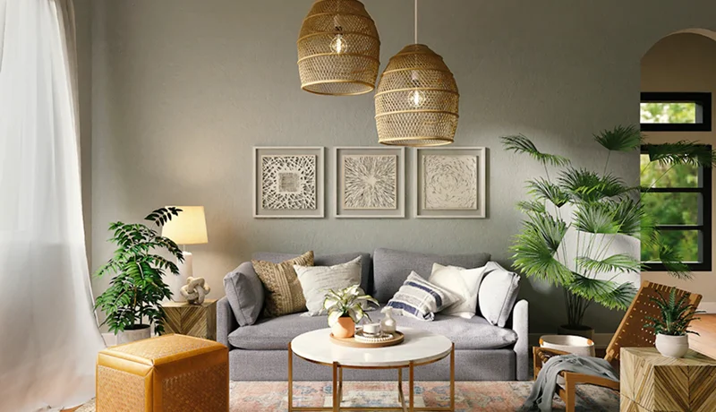
Instead, think about texture as something that travels across the room at different heights and distances. At floor level: a layered rug or the grain of a timber floor. At mid-height: upholstery, drapery, and case goods. At eye level and above: wall treatments, artwork, lighting, and decorative objects.
When you step back from a fully layered room, you should be able to move your eye across every horizontal layer — floor, furniture, wall, ceiling — and find something of interest at each level.
The Role of Scale
Not all texture reads at the same distance. This is something designers think about instinctively, but it’s rarely articulated.
Fine textures — tight weaves, subtle plaster finishes, micro-patterns in fabric — need to be experienced up close. They reward proximity. Coarse textures — chunky knits, rough stone, deeply grained timber — read from across the room and do the heavy lifting visually.
In a well-layered room, both scales are present. The coarse textures establish the character of the space from a distance. The fine textures reward the person who sits down and actually inhabits it.
What to Avoid
Matching textures to each other too precisely. If every soft surface is the same weight linen and every hard surface is the same honed stone, the room has one texture — it’s just a uniform one. Variety is the point.
Layering texture without editing. More is not always better. A room with too many competing materials becomes visually exhausting. Each texture should earn its place. If you can remove it and the room still works, remove it.
Ignoring the ceiling. The ceiling is the most underused surface in residential design. A timber-paneled ceiling, a lime-washed finish, or even a beautifully selected light fitting adds a layer of texture that most people never think to introduce.
A Final Thought
The rooms I’m most proud of are the ones where clients can’t immediately name why they love it. They just know it feels right — warm, considered, alive in a way they weren’t expecting.
That feeling almost always comes down to texture working quietly in the background, doing its job without asking for credit. The linen against the plaster. The leather against the timber. The stone against the wool.
Good design shouldn’t announce itself. It should just make you feel at home.